
From Experience Part 4, By p
It’s been a while since I last wrote for the Setlist Indie Music blog.. but here is part four of my “FromExperience” series and I hope that by sharing what I have learned in making an album of my own will be useful and interesting to you, whether you are a music fan or music maker! If you missed them, check out parts 1 , 2 and 3 of my “From Experience” series that covered what motivated me to make an album of my own, recording the album and the post-production side of making the Reed In The River LP. The remaining tasks to get the album into production were artwork, manufacturing physical CDs and booklet printing, and digital distribution. Some of these things were going on in the background while we worked on mixing and mastering, and others needed to wait till those steps were done. So, in this blog piece I am going to look at those tasks. The artwork was, in the end quite a journey. As I mentioned in Part 1of this series, an early idea had been to work with textural artist Gill Hickman along the lines of her “Stronger Because” series, and at the time, that was actually a candidate for the album title. But as we began to discuss the possibilities for album artwork it became clear that doing something bespoke would be tricky given my timelines and I felt that the artwork, at title needed to fully reflect my story for the album. So, the title was chosen from track 11 on the album, Reed In The River, which is very much about gratefulness learning to go with the flow in life building on experience from past mistakes, failures and learning. The artwork for the 2004 Brothers Falloon LP, Modern Harmonies was designed by Francisco Centofanti, a professional artist and musician friend of our family.
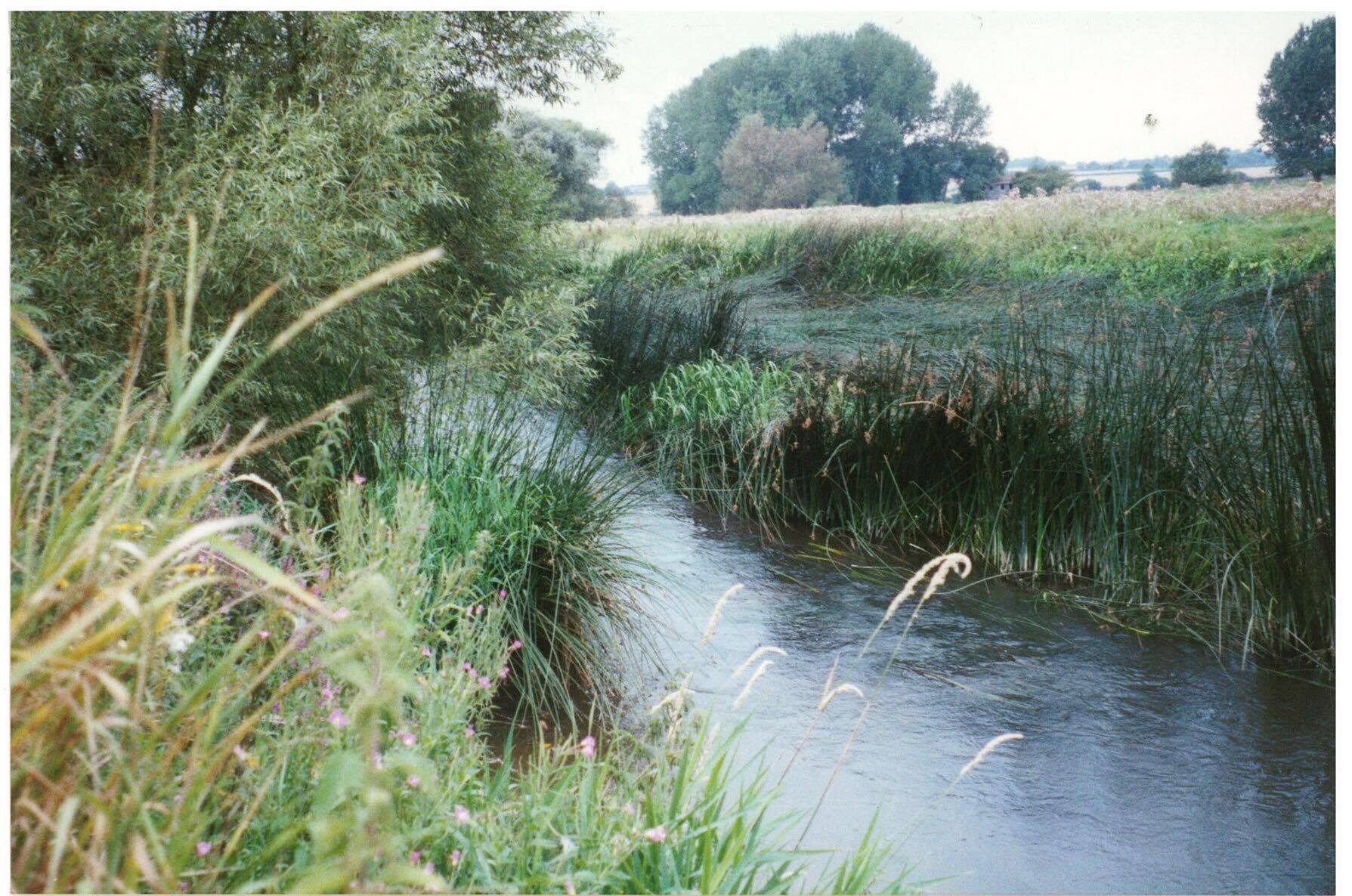
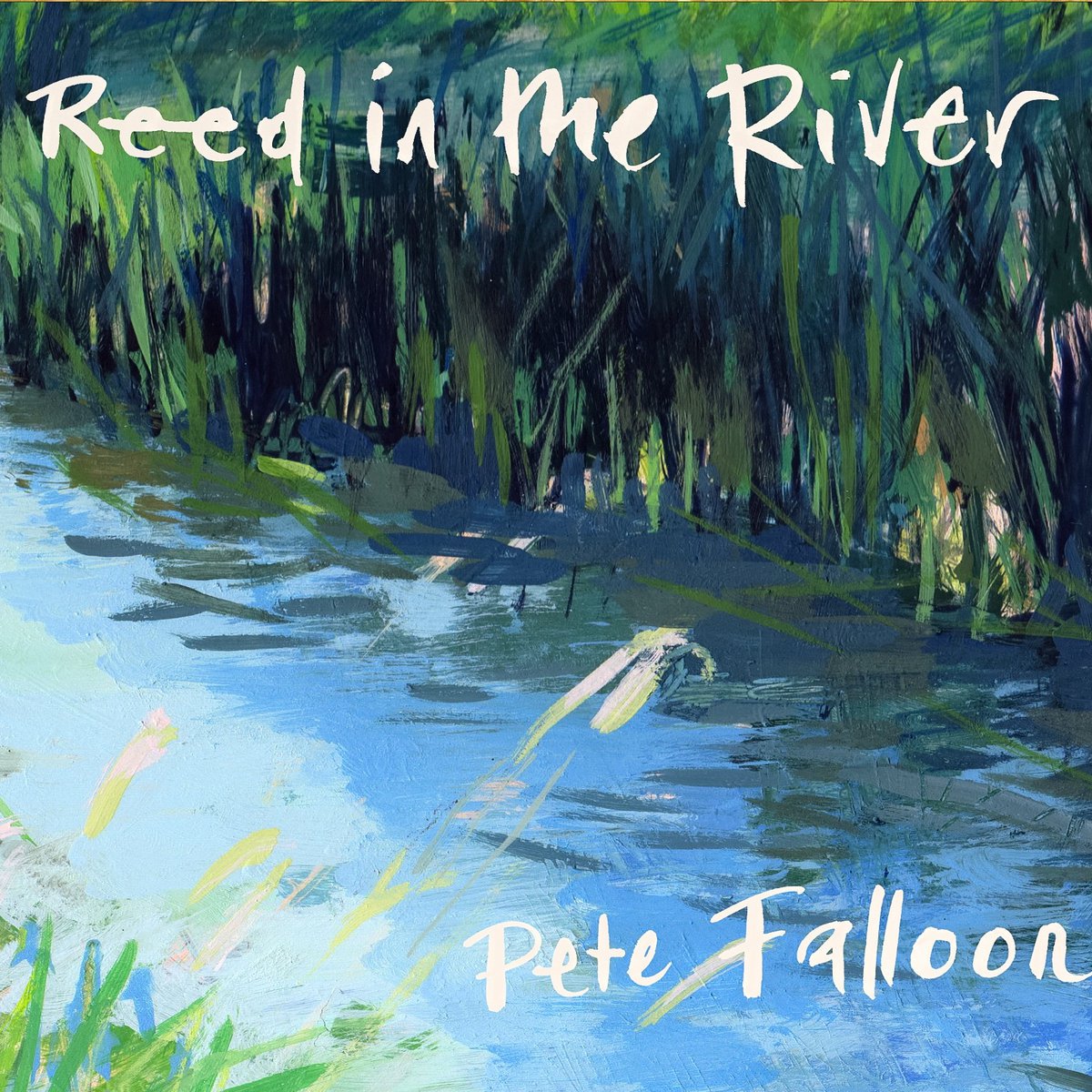
My photo of the River Great Ouse - used by Francisco Centofanti for the album artwork, shown on the right. So, I began to discuss some ideas with Cisco. At that time, he suggested we use Pinterest for sharing ideas, and I used it as a kind of mood board to collect all kinds of images and album covers. It turned out that it was a fantastic tool for sharing visual ideas, both in the sense of gaining a common understanding and being able to exclude ideas. In particular, it really helped me understand how Cisco might interpret my ideas artistically - for example as more sketchy and edgy images like the Modern Harmonies cover; through more cartoon-like ideas to full-blown paintings. The final choice was based on a photo I took ages back - of the River Great Ouse near Newport Parnell (north of London, UK), where I used to spend a lot of time fishing with friends. It depicted a suitably reedy and flowing scene - so Cisco set to work making an A4 sized painting of the scene in egg tempera. We also both liked the idea of somehow using ‘icons’ to represent the individual songs. The resulting icon illustrations ended up in two colors in the CD booklet, and also as separately colored images for use as “singles” or separate tracks on digital platforms. I felt this
last step was an important one as it helps to differentiate songs visually. We played with various ideas on fonts, colors and title work, and finally, Cisco did handwritten titles, similar to those for Modern Harmonies and we chose a blue and yellow scheme for the lyric booklet. I was absolutely delighted with the final result - it was borne through a true collaboration and joint understanding of the music and vision of the album - and I am also now the proud owner of the original painting which hangs in our hallway!
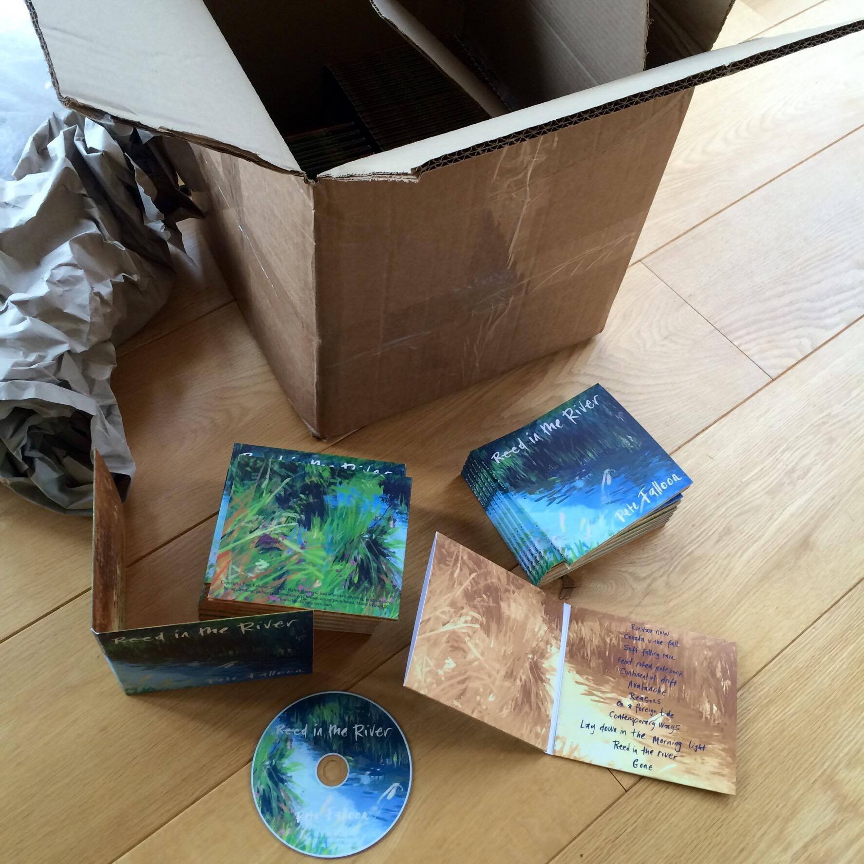
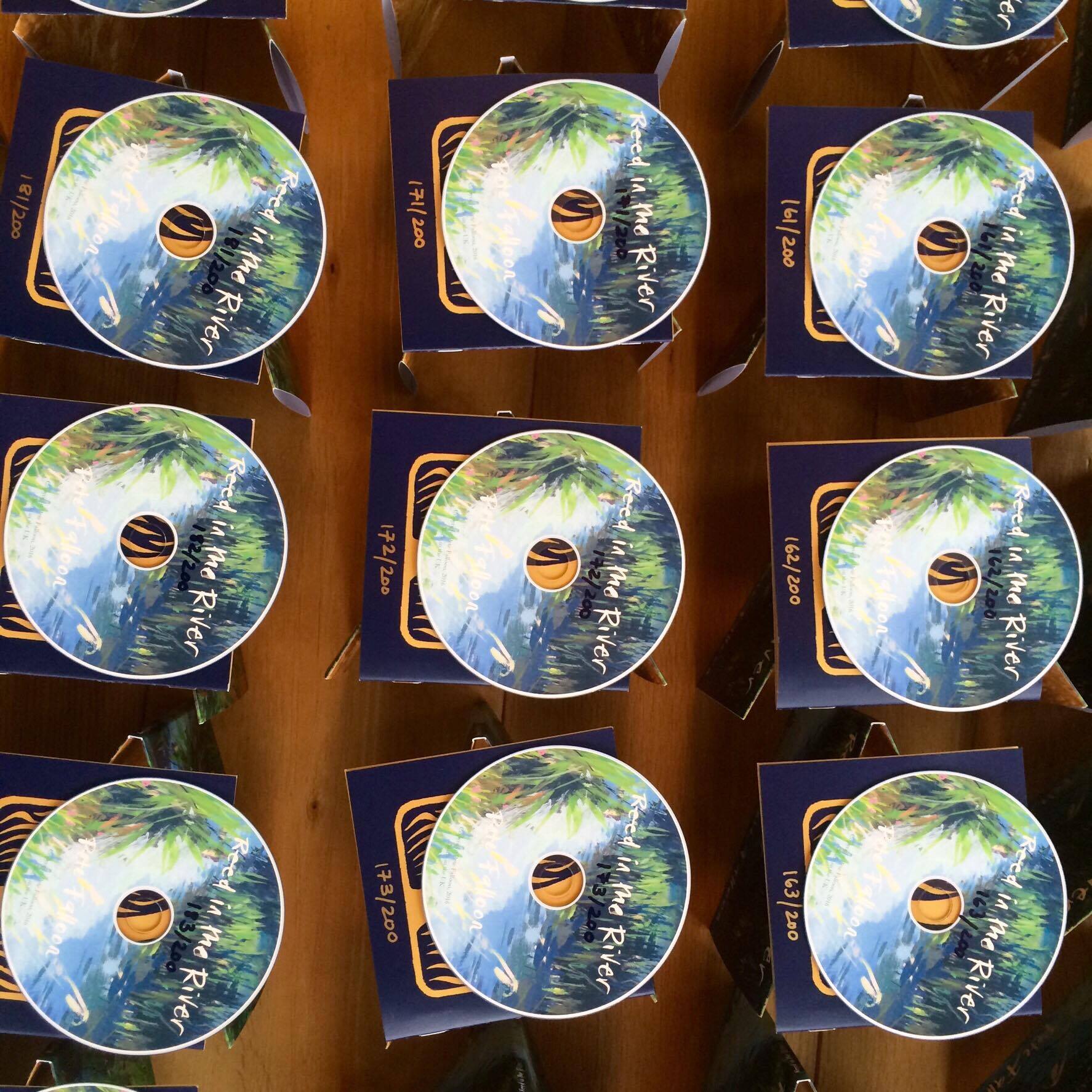
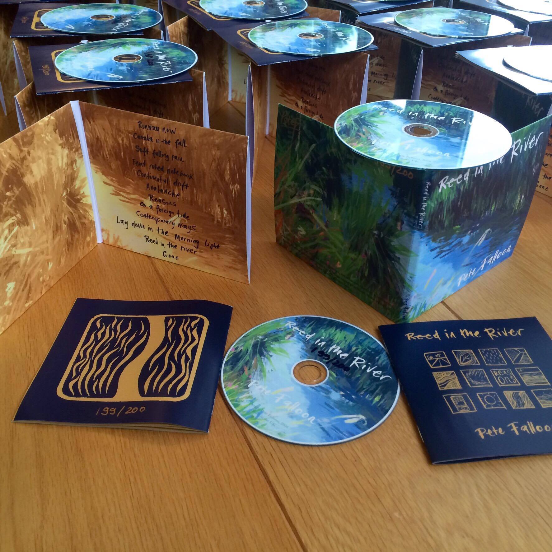
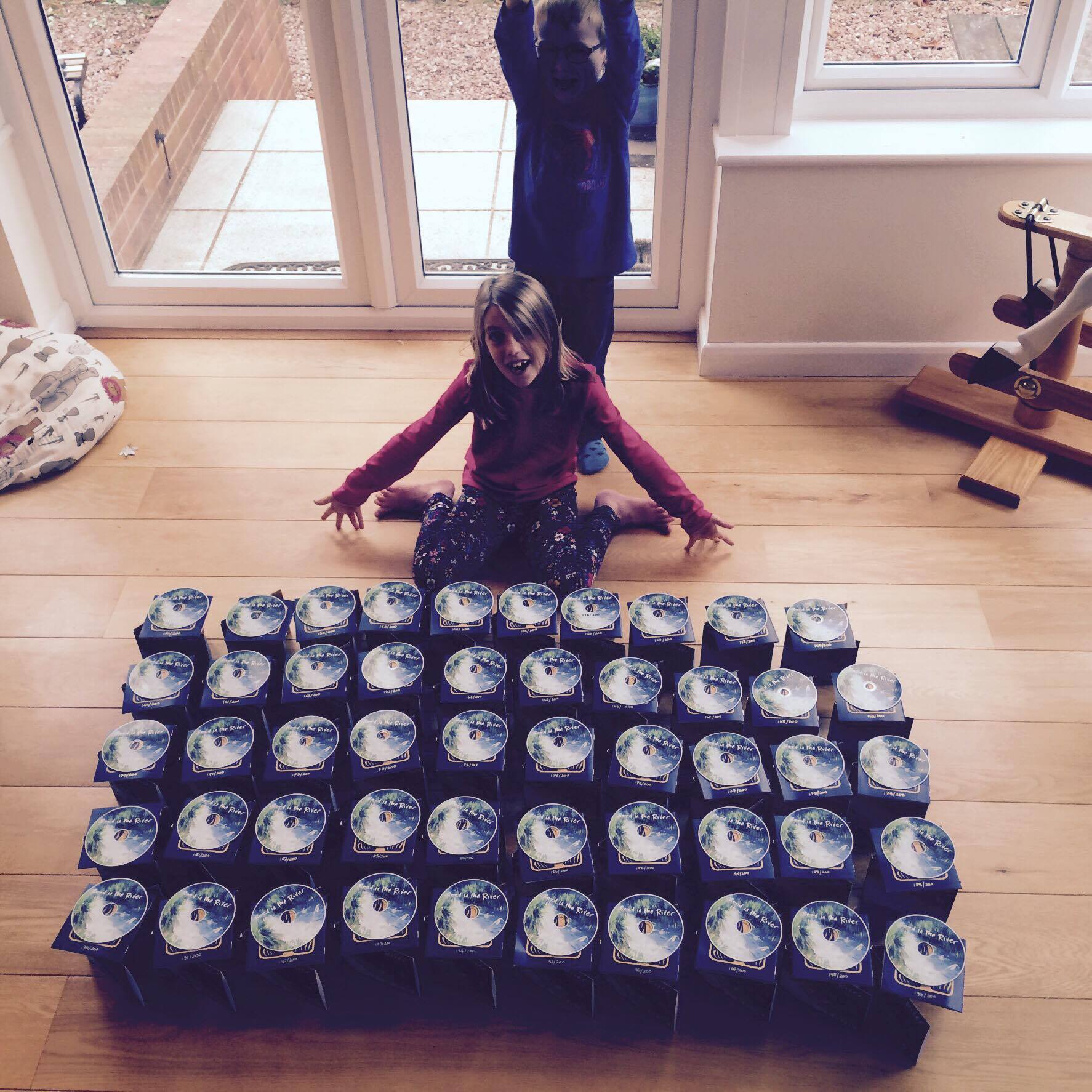
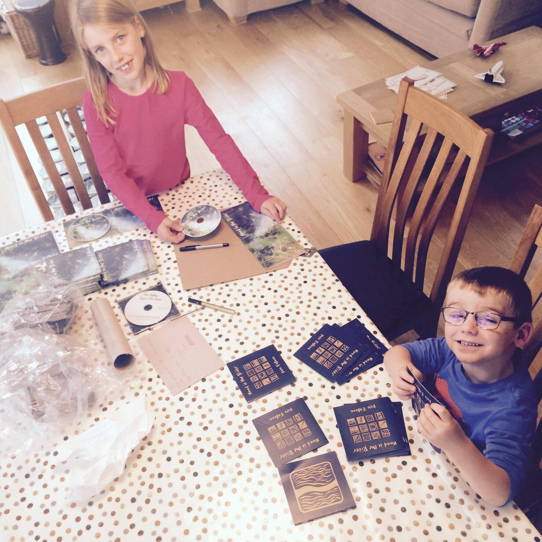
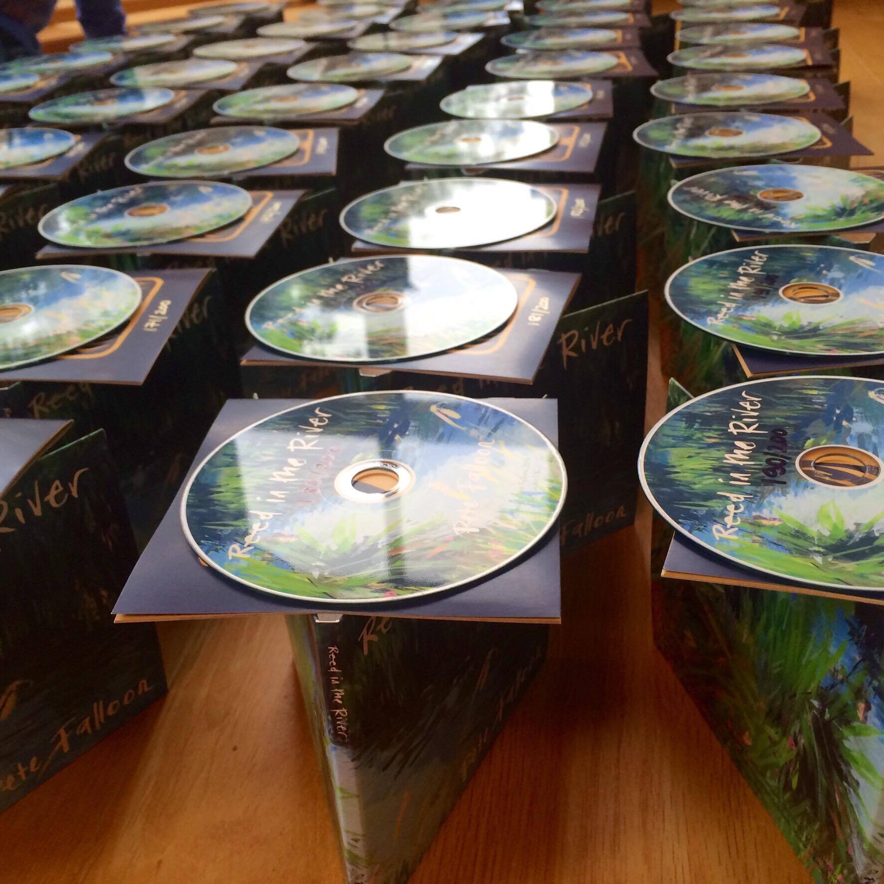
The final product ready to go, and my pint-sized production line at home! The CD manufacturing side of things was fairly straightforward. Between Cisco and me, we decided that a handmade gatefold CD card wallet would work best, with color printing on the disc from a small company he had worked with before (though sadly they are now no longer in operation). The gatefold had one opening for the CD and another for the lyric and credits booklet, which was produced by a separate printing company that I found online. There was a real sense of achievement and also that the project was finally moving towards completion when I received the boxes of printed CDs, cases and booklets in the post. We made a limited run of 200 in this format, and I hand numbered and signed each piece. I got my kids involved in the assembly line putting it all together! In terms of digital distribution (for streaming and download), there are now a host of companies that will get the music out to the relevant platforms (for example, Spotify, Amazon and iTunes, to mention just a few) and I chose one of these that offered a simple service and all returns to the artist for a flat fee - Emubands. This worked very well and basically, they needed artwork and audio files, track listing and song details plus a release date.
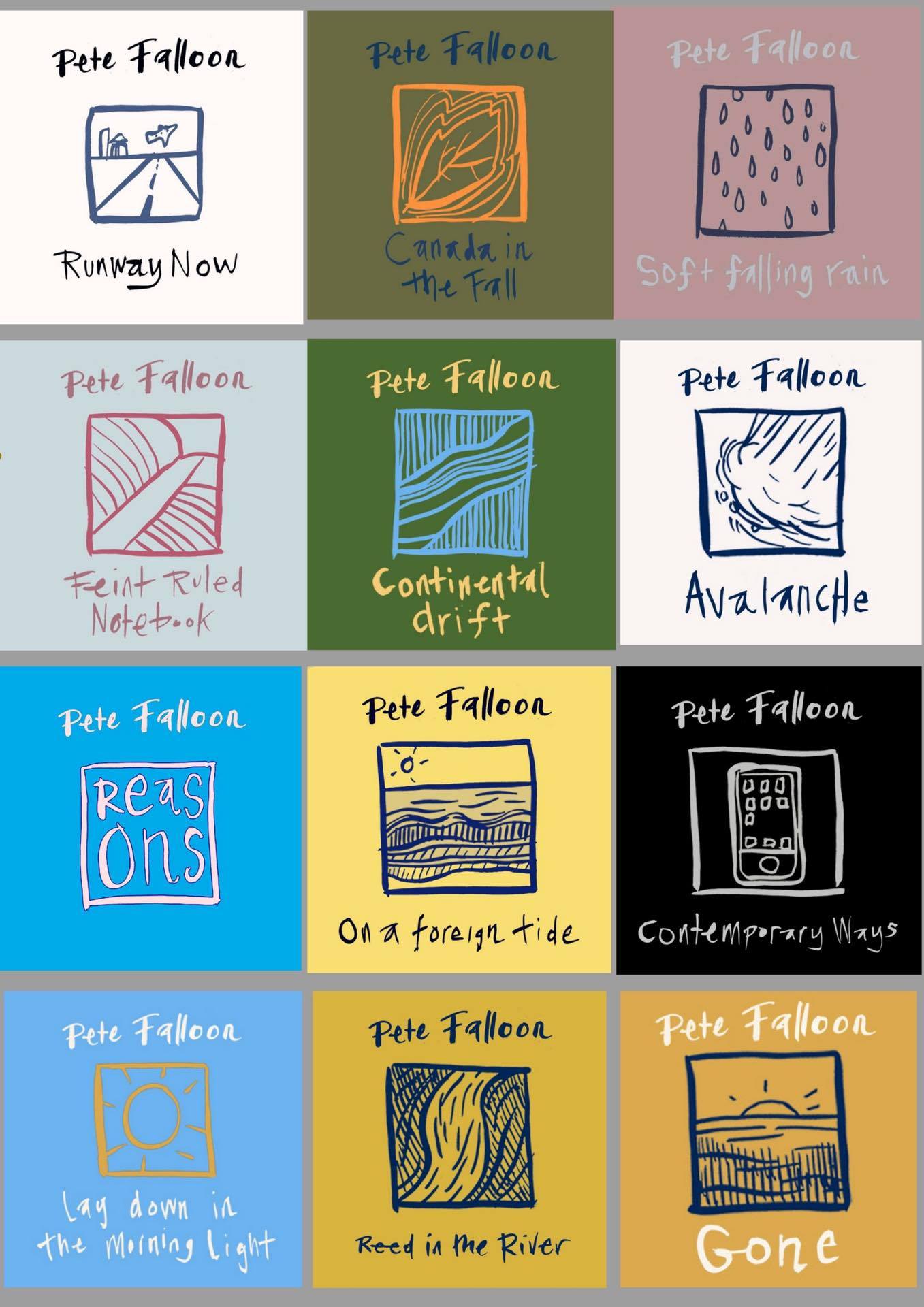
Individual song artwork by Francisco Centofanti. Well, that is the rest of the story for now. In the next couple of blog posts, I will cover, PR and promotion, live shows, reviews, and radio play, ending with a look back at lessons learned along the journey. For now, you can also check out you can check out my interview on the blog, and parts 1 , 2, 3 and 4 of my video premiere series from the album launch show, which also talk about the background behind each song. Thanks for reading! - Pete Falloon